5 Signs It’s Time for a Website Redesign to Drive Growth

Is your website feeling more “retro” than “relevant”? In the digital age, your site is your brand’s first impression—and we all know how lasting those can be. If you’re aiming for growth but your online presence is stuck in the past, it might be time for a makeover.
To help you navigate the key indicators of an outdated website, we’ve gathered insights from our team of experts: Ravi, our Production Director; Katerina, our UX Designer; and Morshed, our Front End Developer. Their expert perspectives will guide you through the essential changes needed to keep your site competitive and engaging.
Let’s dive into five telltale signs that your website needs a redesign to keep up with the times and drive your business forward.
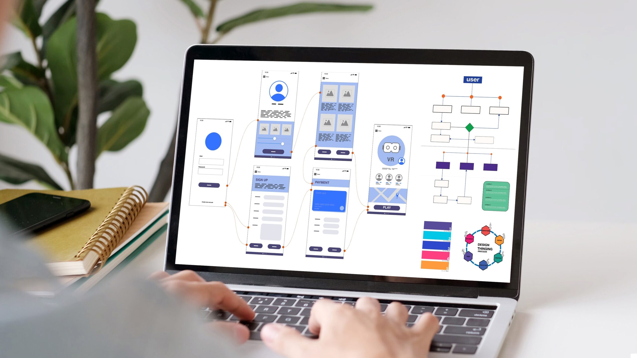
Your Website Looks Like a Digital Relic
First impressions are formed in just 0.05 seconds. If your site screams “vintage” (and not in a good way), visitors might question your brand’s credibility. An outdated design can turn potential customers away faster than you can say “bounce rate.”

Ravi, Production Director, says: “An old, clunky interface with slow loading times or poor mobile optimisation can frustrate users and lead to higher bounce rates. According to the Stanford Web Credibility Project, 75% of users admit to making judgments about a company’s credibility based on its website design. Think of it like a shopfront: if the windows are dusty, the paint is peeling, and the sign is broken, would you feel confident stepping inside? Probably not. The same goes for digital experiences”.
Katerina adds: “The biggest design culprits making websites look outdated are poor typography choices, inconsistent layouts, and unresponsive elements. Even small tweaks, like aligning elements properly and ensuring proper spacing, can instantly refresh a website’s aesthetic and instill trust and credibility in a brand and user experience.”
Morshed emphasises: “Outdated sites often run on legacy code, making updates slow and security weak. Modernising the backend can drastically improve performance and make the site future-proof.”
What to do:
- Embrace a clean, modern design that reflects your brand’s current identity.
- Prioritise user-friendly layouts with fast-loading elements.
- Adopt trending design features like immersive scrolling, AI-driven personalisation, and sustainability-focused web practices.

It’s Not Mobile-Friendly
With over 54% of all website traffic coming from mobile devices, a non-responsive site is a major red flag. If users have to pinch, zoom, or squint to view your content, they’re likely to abandon their visit.
Ravi adds: “Mobile responsiveness isn’t just about aesthetics—it directly impacts engagement and conversions. A mobile-optimised landing page can increase conversion rates by up to 27%. Plus, Google prioritises mobile-friendly sites in search rankings.”

Katerina, our UX Designer, warns against common mobile design mistakes:
- Oversized elements forcing excessive scrolling.
- Small buttons causing accidental taps.
- Annoying pop-ups that disrupt the experience.
Morshed, our Technical Lead, suggests: “Using frameworks like Tailwind CSS, Bootstrap, or Material UI can help ensure a seamless mobile experience. Implementing lazy loading, reducing unnecessary scripts, and optimising images are crucial for performance.”
Quick Test: Pull up your website on a smartphone. Is it user-friendly? If not, it’s time to prioritise a mobile-first redesign. Google Lighthouse is a free tool that tests mobile-friendliness by simulating mobile performance and auditing design, speed, accessibility, and SEO-helping you spot and fix issues for a better user experience and search visibility.

Slow Load Times
Patience is a virtue, but not online. A one-second delay in page load time can lead to a 7% loss in conversions. If your site takes its sweet time to load, visitors will likely leave before they even see what you offer.
Ravi explains: “Every second counts. Slow load times don’t just frustrate users—they also hurt SEO rankings and ad performance.”
Katerina adds UX best practices:
- Optimise images and videos without sacrificing quality.
- Use system fonts instead of custom fonts for faster rendering.
- Minimise animations that slow performance.

Morshed’s tech fixes:
- Implement a Content Delivery Network (CDN) to distribute load.
- Use caching and lazy loading to reduce initial load time.
- Prioritise Core Web Vitals for better Google rankings.
Action Plan: Optimise images, leverage browser caching, and consider a CDN to speed things up.

High Bounce Rates
If visitors are leaving almost as soon as they arrive, something’s amiss. The average website bounce rate is between 26% and 70%, with the optimal range being 25% to 40%. A high bounce rate could indicate poor design, irrelevant content, or a confusing user experience.
Ravi highlights key bounce rate culprits: “Slow loading times, poor mobile optimisation, and unclear navigation are the biggest offenders. Pop-ups and irrelevant content are also common reasons users leave.”
Katerina’s UX solutions:
- Improve content readability with clear typography and spacing.
- Follow the “F” or “Z” reading pattern to guide the user.
- Use subtle animations to keep engagement high.
Morshed suggests: “Technical errors like broken links, slow scripts, and 404 pages should be regularly monitored using heatmaps and session recordings to identify drop-off points.”
Action Plan: Analyse user behaviour, fix navigation issues, and provide relevant, high-quality content.

Difficult to Update
Your website should be as dynamic as your business. If making updates feels like pulling teeth, you’re missing out on opportunities to engage your audience. Modern Content Management Systems (CMS) make it easy to keep your content fresh.
Ravi says: “A flexible CMS is a game-changer. It allows marketing teams to update content without waiting on developers.”
Katerina explains the impact of a poor CMS experience:
- Wasted time on manual updates.
- Collaboration breakdowns due to lack of version control.
- Slow response times to market trends.
Morshed recommends: “Headless CMS platforms like Contentful, Strapi, or Sanity offer scalability and flexibility, while automation tools streamline content updates. Choosing a CMS with built-in API integrations makes adding new features easier in the long run.”
Hint: If you’re avoiding updates because your platform is cumbersome, it’s time for a change.

A well-executed redesign aligns your online presence with user expectations and current trends, leading to increased engagement and conversions. Remember, 88% of online consumers are less likely to return to a site after a bad experience.
Ravi on convincing leadership: “Show them the numbers. A one-second delay costs conversions. An outdated site reduces trust. A great user experience boosts revenue. The ROI speaks for itself.”
A few metrics to track success:
Conversion rates
Bounce rates
Average session duration
Page load time
Mobile responsiveness
SEO performance
Final Thoughts: A Smarter Website for a Stronger Future
A website redesign is more than just an aesthetic upgrade—it’s a strategic investment in your brand’s growth. As our team has highlighted:
Ravi: A well-structured, modern site enhances credibility, drives engagement, and improves conversions.
Katerina: User experience plays a crucial role in keeping visitors engaged, reducing bounce rates, and ensuring seamless navigation.
Morshed: The right technical foundations ensure security, scalability, and high performance.
By addressing these five critical issues, you’re setting your brand up for sustained success in an increasingly digital world.
Ready for a Refresh?
If any of these signs hit close to home, it might be time to consider a redesign. Your website is a critical tool for growth—make sure it’s working as hard as you are.
🚀 Let’s Future-Proof Your Website. Book a free strategy session today and take the first step toward a site that works smarter, not harder. Let’s Talk!